Stock Photos to Avoid
We know visual marketing has a much more profound effect on consumers. (There’s a reason why companies use 20-something models instead of overweight, 60-year-old bald men to advertise their product, right?)
And with the increased interest in Pinterest, Instagram, and Facebook, it’s plain to see people like to interact visually with others.
For insurance agencies, this can be very difficult to do. Your product isn’t one that people are clamoring for, nor is it one that a young, attractive model is going to make sell faster. So the question is how do you engage your audience visually on your website when you don’t really have a product that lends itself to that?
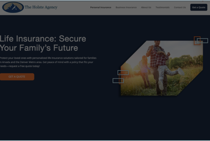
My recommendation is that every photo or picture on your website should tell a story. It should let the reader know exactly what’s on the page without necessarily having to read the page. For insurance agencies, this requires creativity, outside-the-box thinking, and even bravery to step away from the norms.
With that in mind, I present to you the 9 types of photos you should never, ever use on your site. Most of it consists of just your standard, run-of-the-mill stock photography that you see on most insurance websites. The problem with the following photos is they don’t offer any realism, they don’t create a connection, and they’re just plain boring.
9 Photos No Insurance Agency Should Ever Use on its Website
*With snarky commentary on each one because I couldn’t help myself.
1. The “We love our office so much, we’re going to jump for joy!”

We love our so much we must jump – right now!
2. The “We work with contractors so we have to show a building being constructed, right?”
What can I tell you — we just love pictures of buildings in their construction phase.
3. Clipart
1995 called, they want their web graphics back.
4. The Customer Service/Call Center Photo

Unless your agency really has a call center this photo must go.
5. The Generic Corporate Building

We love pictures of random buildings that aren’t ours. (Side thought with this: You don’t ever see large corporations showing pictures of how big their buildings are, and you usually won’t see small business show off how small their offices are. It’s like we can’t make up our mind.)
6. The Team Meeting Photo

I can only imagine what my staff would say if I told them to come in for a group cheer.
7. The “We’re Serious About Our Job”

Has anybody worked with someone because they looked more serious?
8. The Generic Idea Photo

I would like this photo better if the items written down were a shopping list or at least something clever like that.
9. The Enthusiastic Meeting

Most insurance agency meetings I’ve been in include people trying to check their Facebook or play games on their phone. They typically don’t include people enthusiastically huddled around a laptop.


